
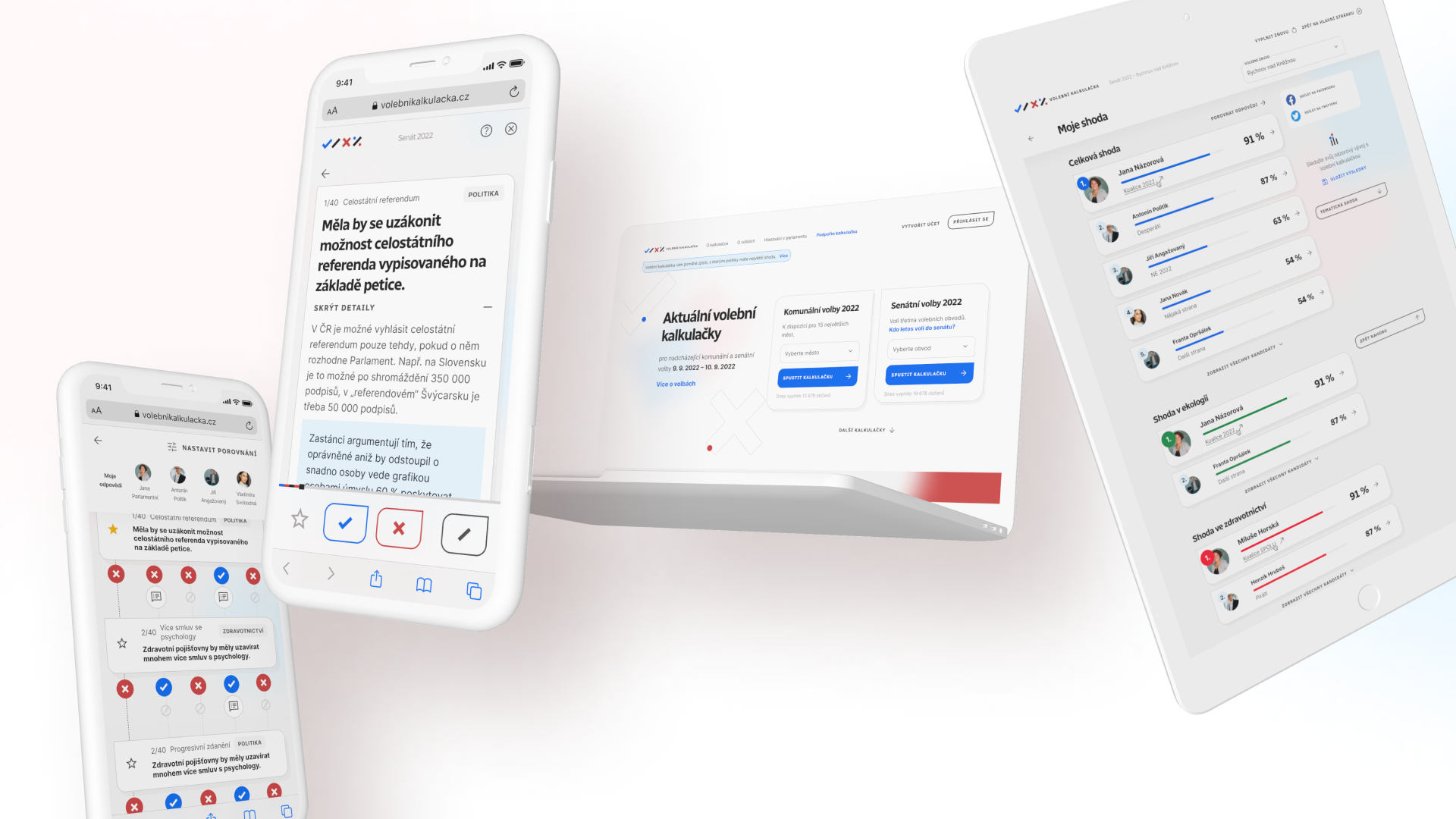
For the Czech election compass "Volební kalkulačka" that tells users how they match with political candidates in opinions, I created a new branding and design system based on explorations we did together with Natalia Bebjakova & Dora Stamenova.
The challenge was to make the design system flexible and theme-able while still recognisable when the calculator is embed on different news media sites such as Seznam Zprávy (where authors Michal Škop and Kateřina Mahdalová work and where the calculator is released first) and themed for the particular medium. This was the biggest and surprising outcome of the research my colleagues together with UX researcher Pavla Řádková found: that the original design caused people not recognising it was the same app across different media, causing a side effect of decreased trust in the app.
I joined the project after initial UX research to help with branding, but my role soon shifted to a role of design lead. Apart from UX & UI design, I e.g. conducted usability testing or gathered and analysed feedback from social media from which we worked on further improvements.
In the mockup, only designs and not current implementation are presented; due to development in voluntary environment, this is "north star" we progressively work on.
Teamwork 💪 with Natalia Bebjakova, Dora Stamenova (UX Designers), Pavla Řádková (UX Researcher) and whole dev team with led by Kryštof Korb (with whom we created the design system and its smart tokenization allowing the theming). Shoutout to Lucie Zátorská, our project manager, too, for keeping the project running 💙 and most importantly, Michal Škop and Kateřina Mahdalová, the authors of the calculator itself, for their important data journalistic work in this country.
Project is run under Česko.digital.